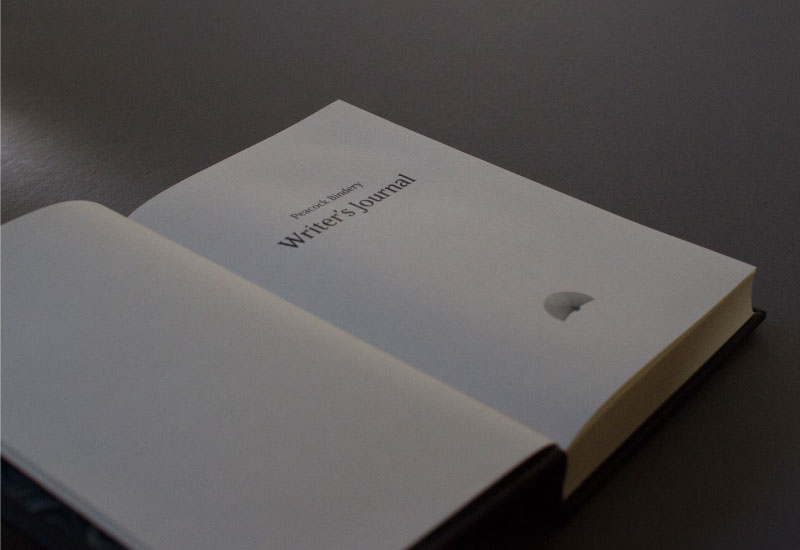
Peacock Bindery
Susan Peacock – a retired lawyer, began training as a bookbinder in 2006. Her goal was to restore the book collection left to her by her grandfather. Since then she has trained with master bookbinders both in New Zealand and abroad and has received a Diploma in Conservation Binding from the American Academy of Bookbinding – one of the few institutions in the world to offer qualifications. She is a member of the American Institute for Conservation of Historic & Artistic Works.
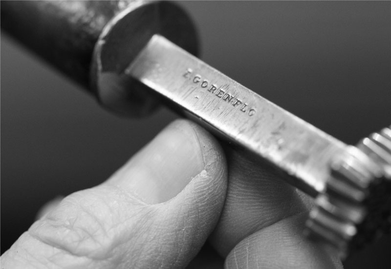

Susan's studio – a converted loft above her double garage in Thorndon – is a treasure trove of finely crafted tools and materials, all housed in modern, cleverly moveable modulated storage units making the most of her compact space.
Susan takes her role as a conservation bookbinder seriously. She uses high quality materials and best practice techniques to restore books to their former glory. Our task was to make sure the new identity reflected her craftsmanship and skill. The project encompassed core branding, signage, photography and image-making, as well as website design and development.
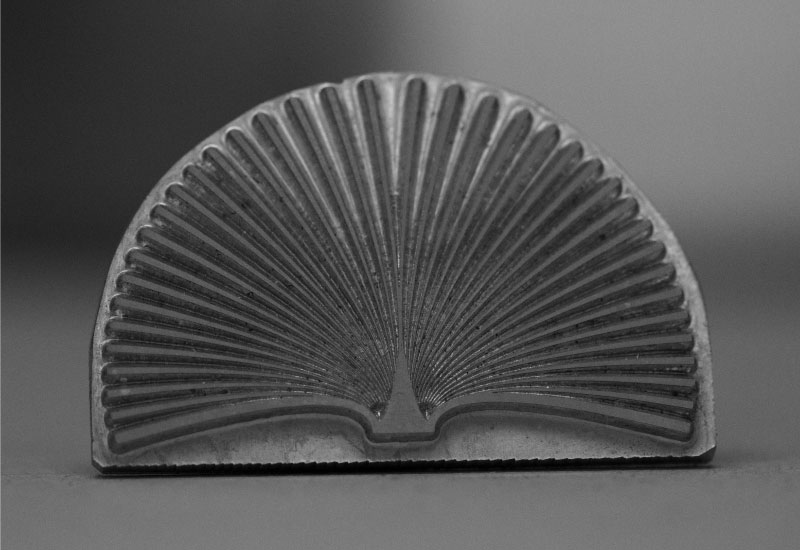
The beauty of the mark component of the logo is it shouldn't need much explanation — even without the accompanying type. While it is perhaps an obvious decision to focus on the visual similarities between a peacock's plumage and the form of an open book, it helps create the basis for an instantly identifiable and memorable identity.
Susan's studio – a converted loft above her double garage in Thorndon – is a treasure trove of finely crafted tools and materials.
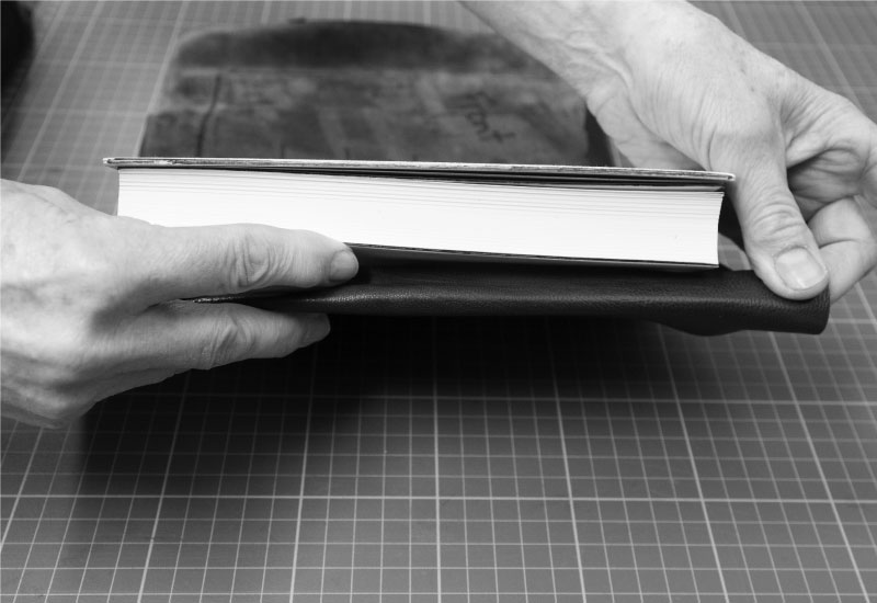
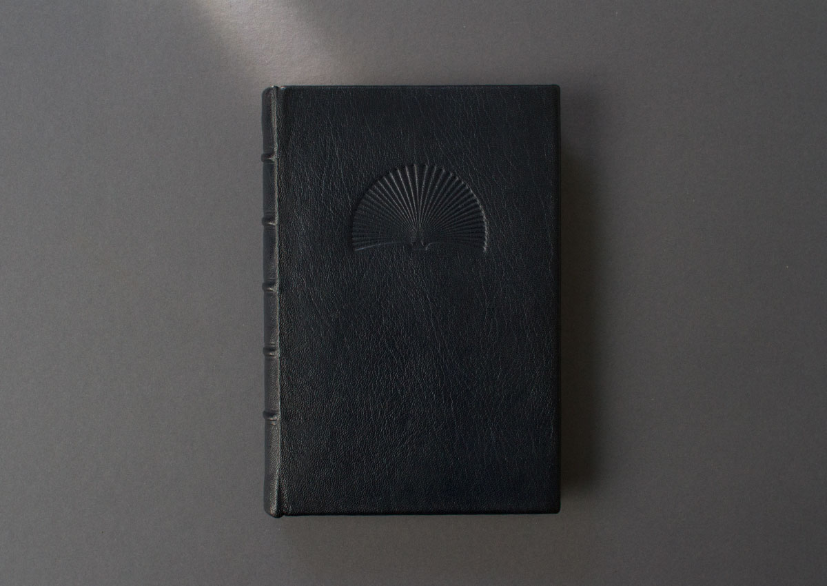
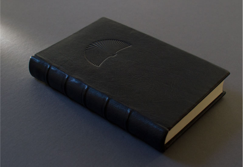
Hand-made journal to take to client meetings and the bookbinding conventions she attends.
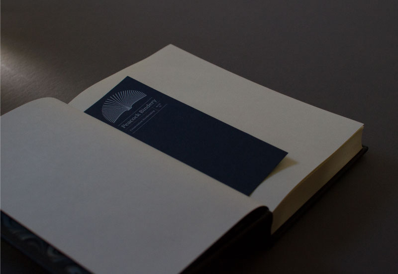
One unique aspect to Susan's practice is that she works with literary artifacts from another era. To help reflect this meeting of two worlds we combined traditional type compositions with a more contemporary layout. An example of this is how we approached the layouts of the business cards and bookmark; we treated both sides of these items as a continual surface with the logo and contact information bookending these canvases – with generous white space in between. The web is an inherently current medium — in the website layout we used justified type, drop caps and predominantly black and white imagery to juxtapose the new and old.
Emigre's Matrix II was initially somewhat of a wild card selection, but unlike many of the typefaces we tried, was strong enough to hold its own with the mark element, while bringing a quirky element to the identity. This typeface choice also fitted with our narrative of blurring the lines between contemporary and historic.
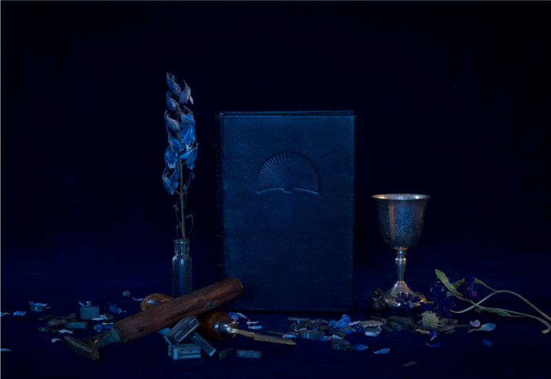
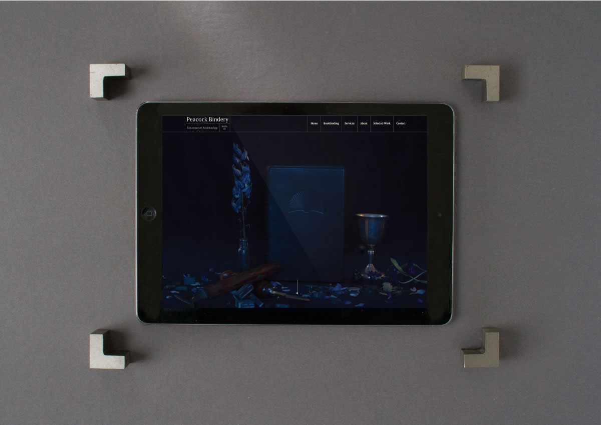
We created two campaign images – inspired by 17th Century Dutch still-life paintings – to be used to enrich and bring depth to the identity. These are designed to be used for print, web and social media applications.
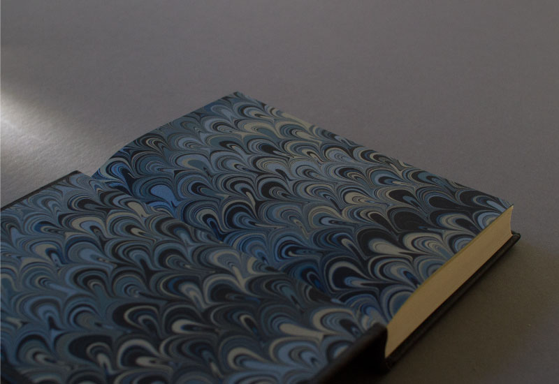
Finally it seemed fitting – as a natural progression for her brand – that she really needed her own hand-made journal to take to client meetings and the bookbinding conventions she attends. In collaboration with Susan we selected finishes and paper stock options, which she then created into a beautifully crafted book finished with blind embossing and tooling.


Visit the website here peacockbindery.co.nz
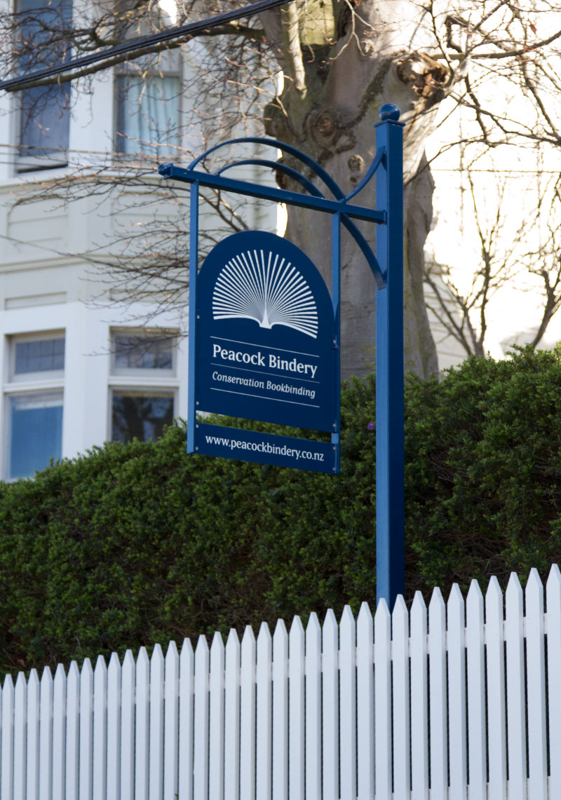
Peacock bindery sign and stand design.

Peacock Bindery was a finalists in the small brands category at the 2018 New Zealand Best Design Awards.
Photos by: Jess O'Brien