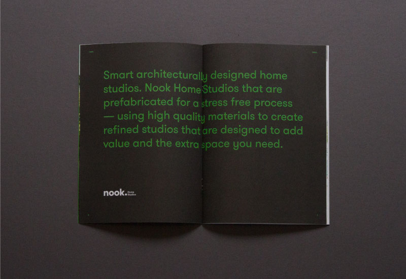
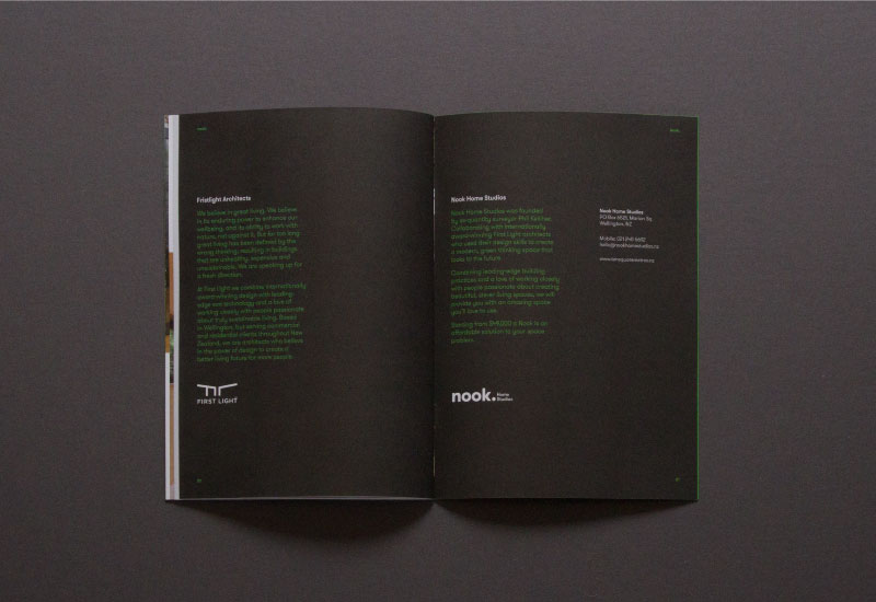
Nook Home Studios
Nook Home Studios are a architectural start-up. They approached us about creating a brand for their home studio concept. It was early days, but they had had the plans designed — by up-and-coming studio First Light — and wanted to hit the ground running when their first concept was complete.
In the planning stage we asked if they would entertain a different take on the name, and through this process, Nook Home Studios was born.
The key concepts that define Nook Home Studios are:
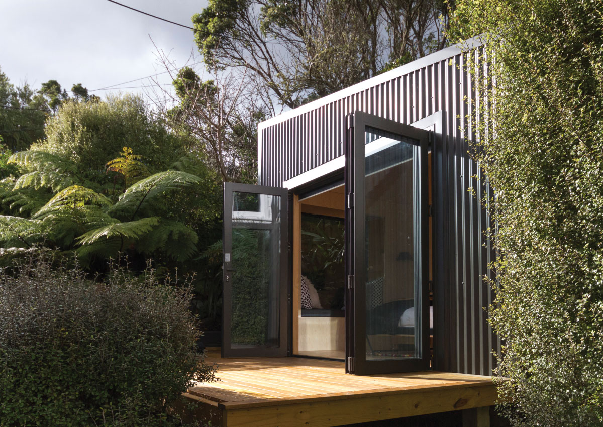
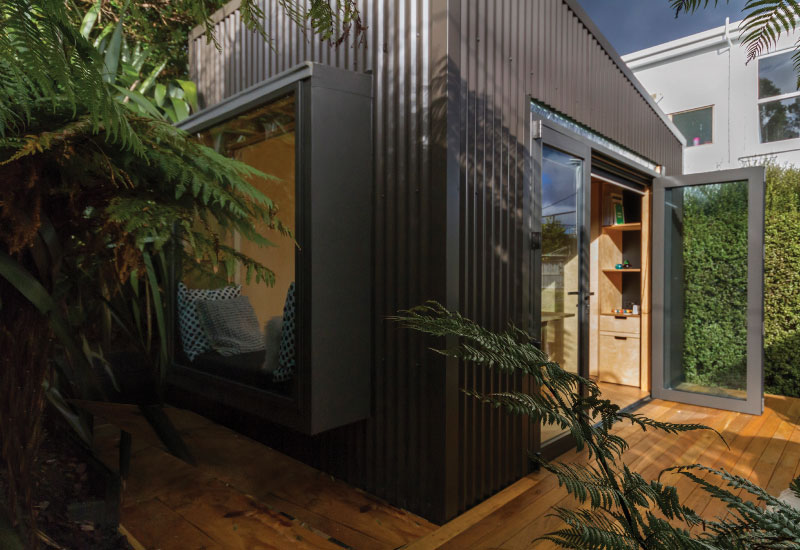
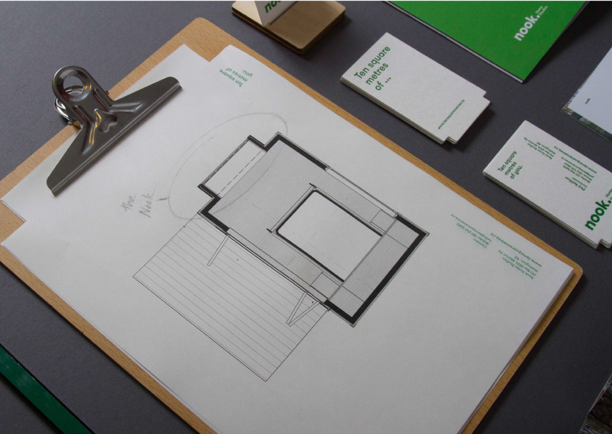
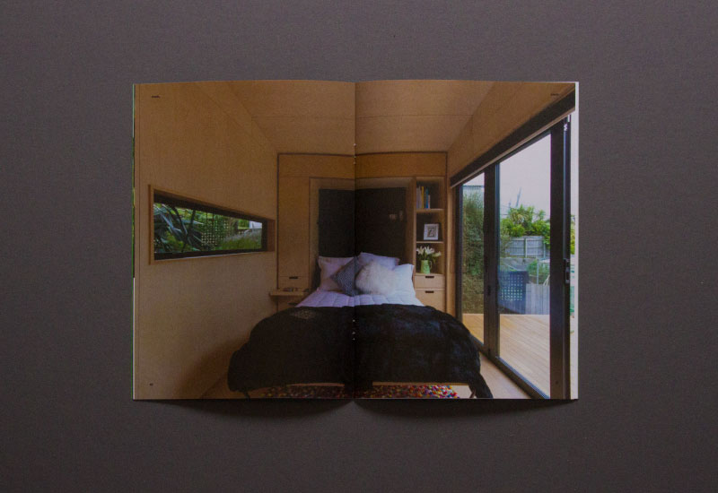
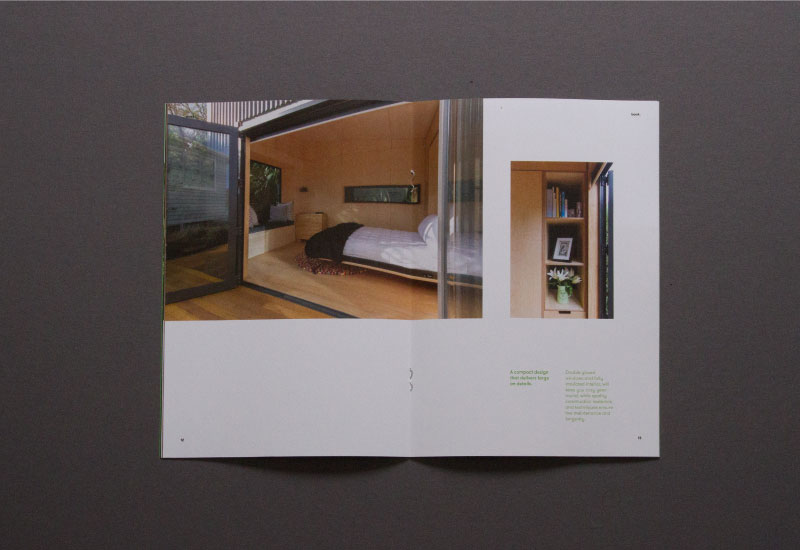
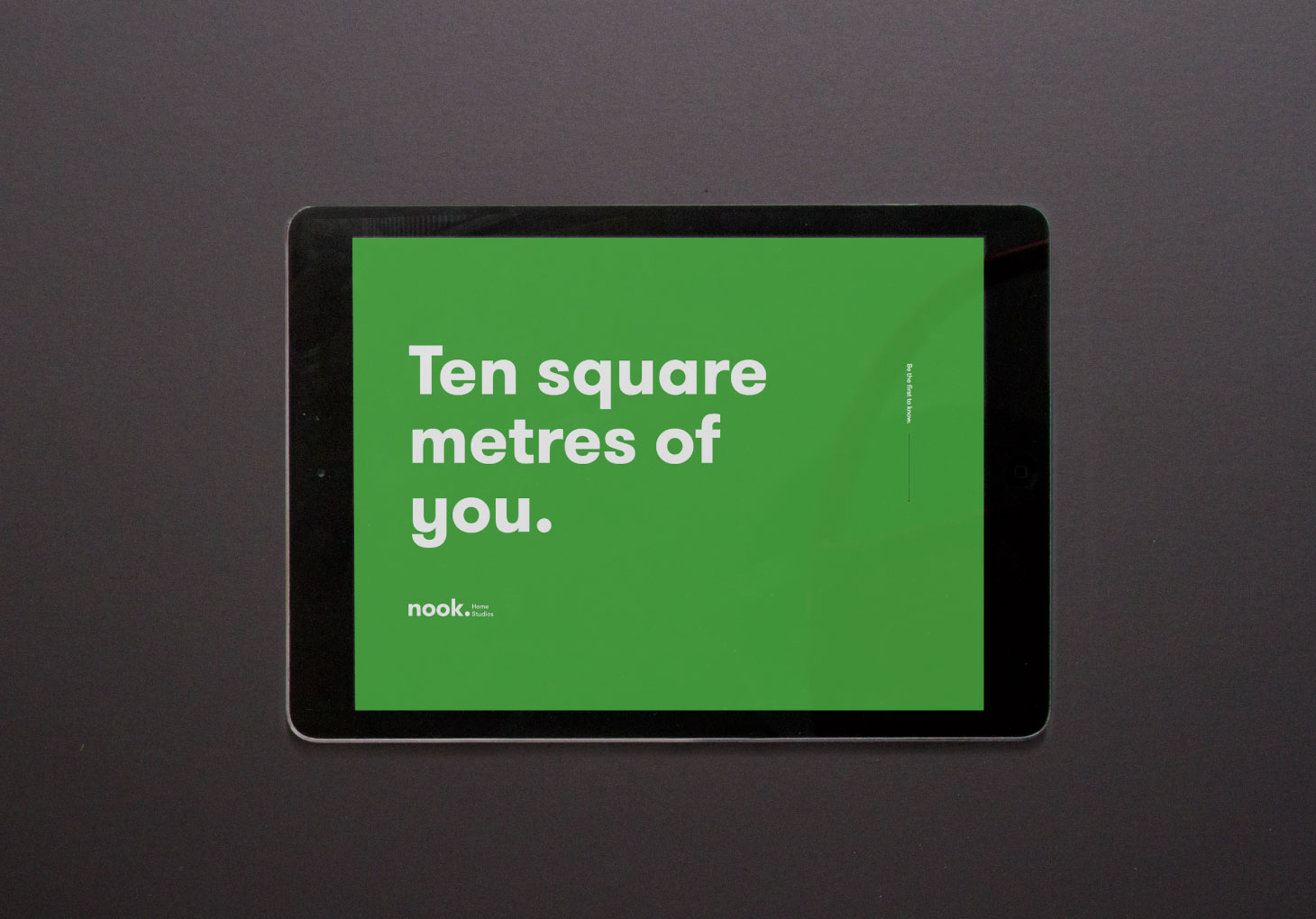
- They are ten square metres — which removes the need for building consent
- They are a high quality, prefabricated product — not a bespoke build.
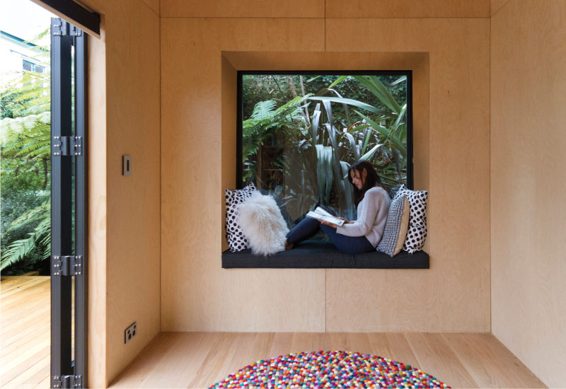
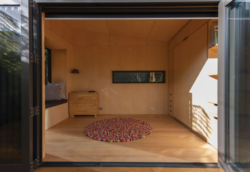
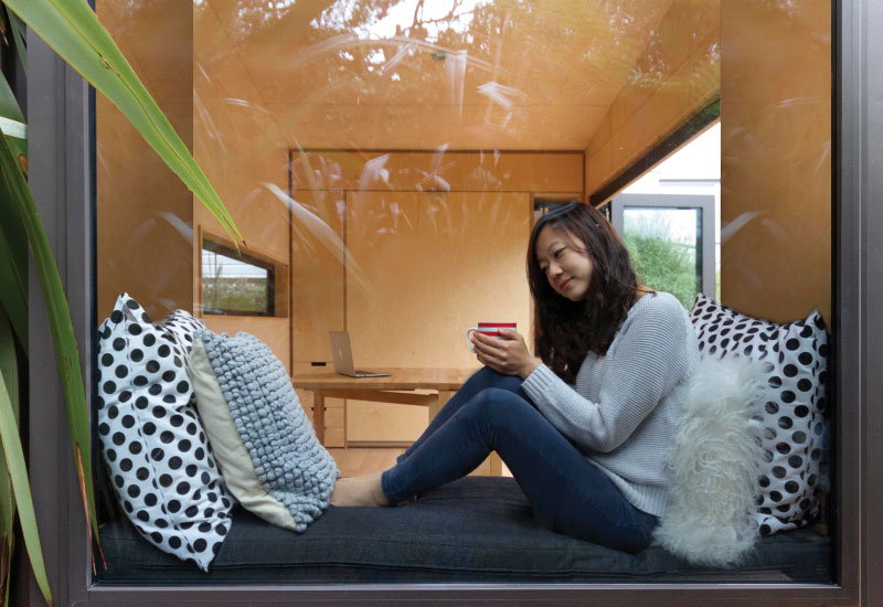
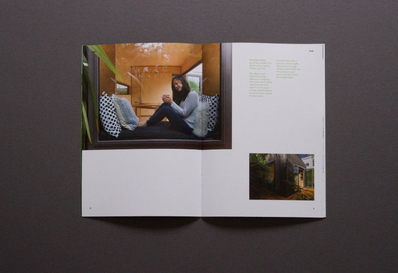
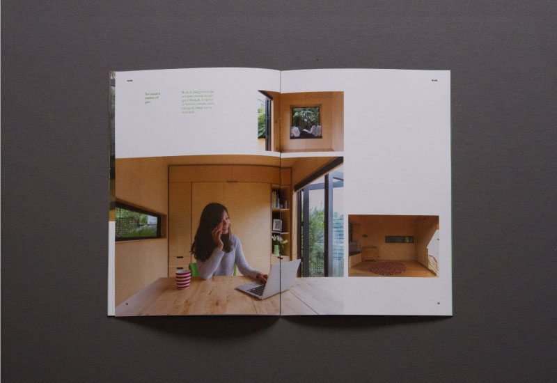
- They feature a large portal window (the nook) that extends outside the ten square metre floor plan expanding the livable area.
In response we created the brand focusing on two of these key points:
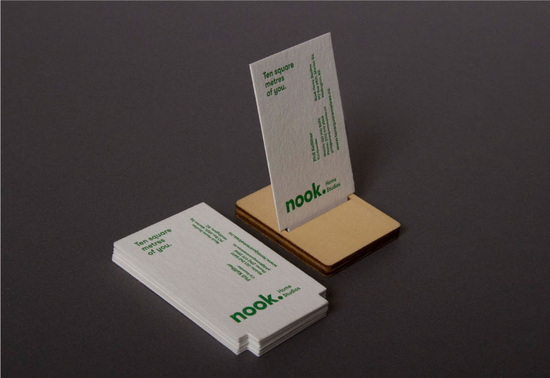
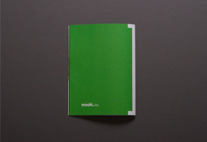
Firstly “the nook” — we devised a visual system using this key feature to inform the brand material. The business cards and letterheads are die-cut to mimic the studio's floor plan — with typography arranged to resemble a room layout. For the booklet we used the used the Nook shape in a form reminiscent of bookbinder's spine tape. On the website we've used a Nook inspired navigation bar. This simple visual system can be used to inform almost any brand application — often as a functional device, whether a way of fastening a sign or for a interlocking paper latch.
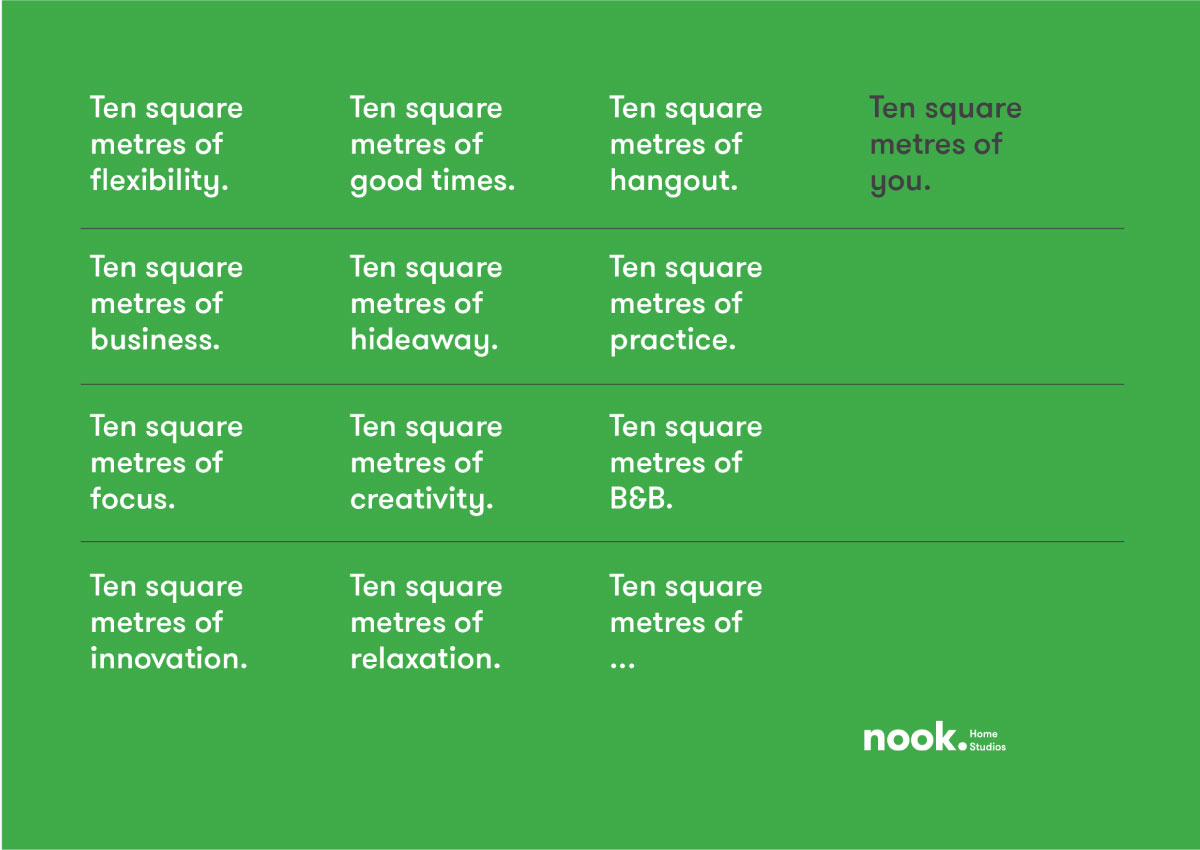
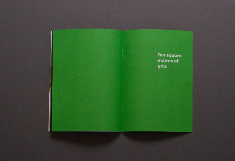
We saw the ten square metre size as a key concept and really wanted to stake claim to this idea as part of Nook's brand. To to do this we came up with an expandable word play — 'Ten square metres of you' — that links this crucial size with Nook's versatility. 'Ten square metres business' to describe a home office, 'Ten square metres workout' for a gym and 'ten square metres creativity' for an art studio, and so on. This word play can also be used to describe the Nook itself i.e. 'Ten square metres of innovation’ and 'Ten square metres of flexibility'.
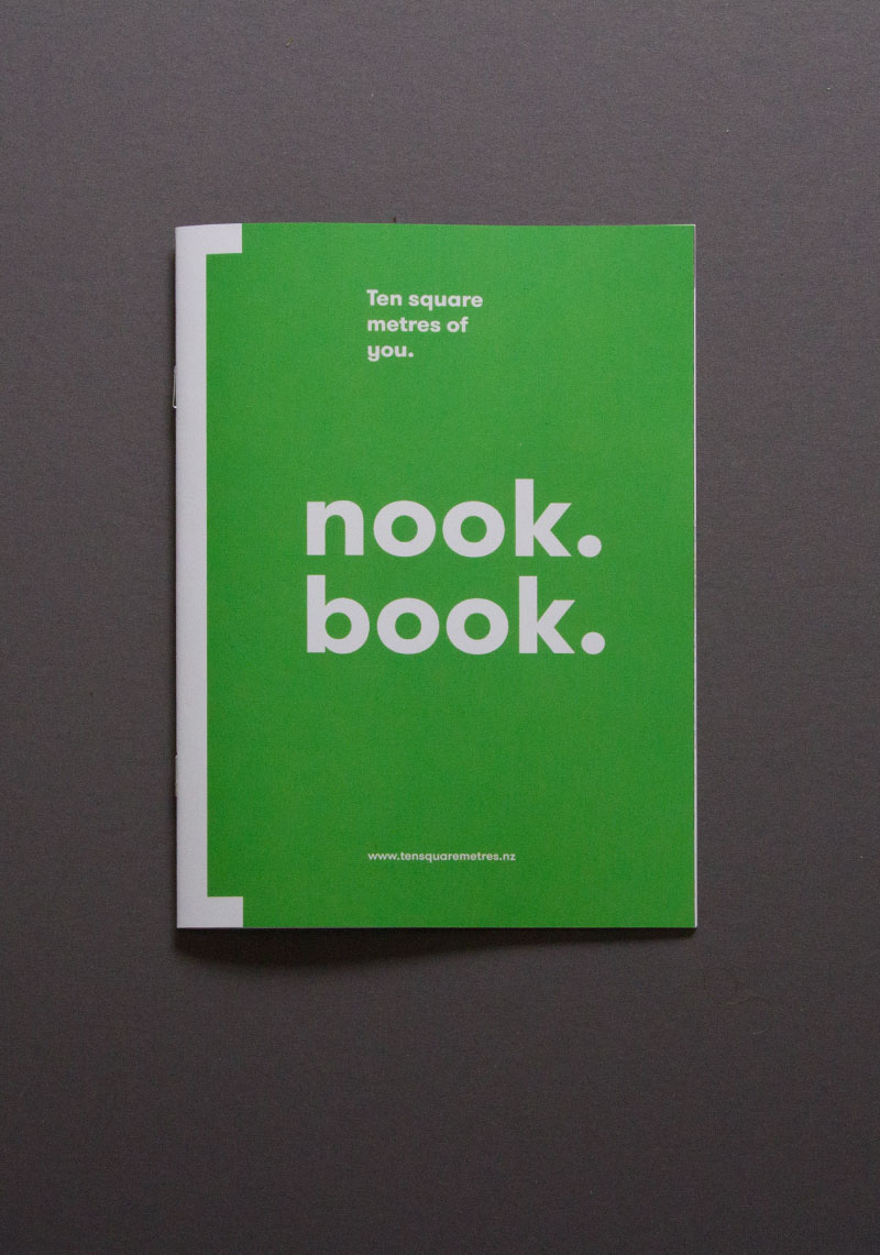
We also continued the names fun and catchy nature into other aspects of the copywriting, like the “nook book” (reminiscent of 'look book' and “cook book”).
We wanted the brand to feel easy and innovative. Type is set in Grilli Type's GT Walsheim. Pantone 261 (green) to make the brand feel fresh and bright.


Nook Home Studios was a finalists in the small brands category at the 2017 New Zealand Best Design Awards.
Photography by Jess O'Brien